How to bring more diversity and inclusion to your PowerPoint deck
A failure to find photos that represent the diversity of your community risks losing your audience. Here’s how to find better images.

Have you taken a close look at the photos that you use for your PowerPoint presentation slides? You can bet your audience has.
What do they see? Do many of the faces look the same? Have you unintentionally perpetuated social or professional stereotypes?
The photos that many public speakers select for their PowerPoint presentation slides reveal a lack of diversity. It’s often the result of unconscious biases—beliefs and stereotypes that we aren’t even aware we hold—about age, religion, ethnicity, education, physical ability, looks, appearance, gender identities, sexual orientation and social class. However, this unintentional exclusion can jeopardize your connection with your audience.
Of course, it’s not always an unintentional oversight. Sometimes, the source material can pose a challenge to more inclusive PowerPoint presentations.
Searching through images on a stock photo service can be a hard slog. Do a search for “people at a meeting” on some of the sites and anywhere from thousands to tens of thousands of images can come up. If you are lucky, the first dozen or so photos yield a broad cross sample of people. Otherwise, you are combing through a rather homogenous selection. Given time constraints and deadlines, it’s understandable—though not acceptable—that presenters save time by not doing a deep dive into image selection.
But there are resources and sites that are doing their part to provide content that addresses diversity and inclusivity.
For instance, Seattle-based Getty Images, a global supplier of more than 200 million stock photos and images for businesses and consumers (which also owns iStock, a stock content marketplace), teamed up with GLAAD, the LGBTQ media advocacy organization, to improve the availability on its sites of visuals which authentically represent the LGBTQ community.
“We believe that if you can’t see it, you can’t be it—and have taken action over the last decade to ensure that we are pushing the visual language forward by actively creating content which improves visual representation for historically underrepresented communities, which include those within the LGBTQ spectrum,” noted Grant Farhall, chief product officer at iStock.
He continued:
“In every instance, we intentionally work with the experts to ensure that the guidance we provide to our contributor community is all at once accurate and forward-thinking, which is why we reached out to GLAAD as our partners in this particular endeavor. Our first collaboration around accurately depicting the transgender community launched in December 2020, and we hope to begin adding content inspired by these guidelines to our site in the next few months.”

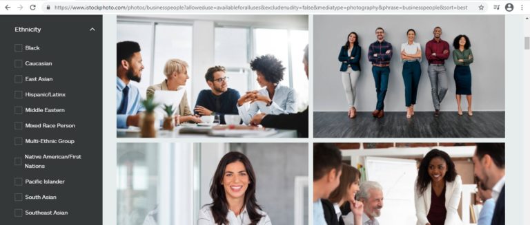
Credit: iStock screenshot Stock content service iStock, which is owned by Getty Images, recently launched some new search filters. There’s one for ethnicity (seen in this screenshot) and another for age.
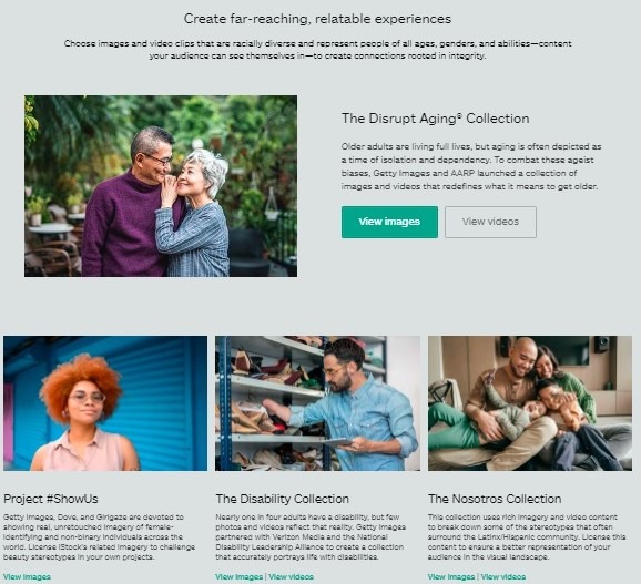
The iStock library has also added new search filters, including those for ethnicity and age, as well as several new collections grouped under an “inclusive storytelling” umbrella. Farhall calls it an “entry point” to images and videos that, according to the company’s website, “shine a light on underrepresented communities, drive change, and reflect life in its truest, most authentic form.”

Credit: iStockscreenshot Stock content service iStock recently added new image collections that are grouped under an “inclusive storytelling” umbrella.
You can find images of people with disabilities working and playing sports, older people enjoying life, women in leadership positions taking charge. In other words, these images are depicting all the life that is going on that might not be reflected in your slides.
And there are other resources, too. Presenters still had plenty of options before these latest initiatives to find more diverse and authentic photos. This Huffington Post article lists several sites that have been creating and providing more representative images for years. This article lists more than two dozen, among them:
- Mocha Stock – This site launched in 2017 to provide quality stock images and content that focuses on people of color.
- Diversity Photos – It’s right in the name. This stock photo service presents content aimed at dispelling stereotypes and addressing the challenge facing its customers—”finding images that look like the audience they need to communicate with.”
- Tonl – A stock photography service that strives to “challenge the stale, homogenous look of traditional stock photography.” Images instead focus on everyday people of many different ethnic backgrounds.
- Picnoi – This free stock image site was created to provide a space for “publishers, bloggers, website owners, marketers, designers, graphic artists, advertisers, and the like … [to] easily search and find diverse multi-racial images.”
Selecting your photo
As you move forward in selecting images for your PowerPoint slides, or slides for any other presentation software, be as thoughtful as you can. However, you can’t simply check off all the boxes. An effort to insert every demographic group is likely to backfire and come off as inauthentic. Rather, it’s about looking at the bigger picture. Do your images—on the whole—reflect the diversity of the world in which you live?
Start here: Try to identify the biases and stereotypes you may carry. Educate yourself as to the potential prejudices your selections may have revealed. And then seek out resources that will help you to make better choices.
It’s worth the effort, on many levels.
If you’ve loaded your slides with people who only look like some of the people in your audience, it could make you appear oblivious to the actual world we live in. That’s the best-case scenario. And, while you may not have deliberately aimed to exclude, your audience’s perception is really all that matters. All they see are images that indicate you appear insensitive and biased, which inevitably can strain, if not sever, your connection with your audience.
For instance, if you are talking to a group of young CEOs, and slide after slide of your version of a chief executive is a distinguished, silver-haired senior, then you are telling your audience, in effect, that you don’t see them. Or, that you believe CEOs can only be a certain type of person. That may not be your intent, but your images will make it more difficult for you to engage with your audience.
Why make the effort for a PowerPoint presentation?
Taking stock of the images you use would be worth the effort any time, but it’s particularly relevant after the year we’ve had. Though dominated by a global pandemic, 2020 also was the year of the global rallying call of the Black Lives Matter Movement and racial justice following the death of George Floyd. There also was increased attention on the disparities in healthcare, the workplace, and social policies that left some communities more vulnerable to the virus.
Is it too big a leap to move from social justice and equity movements to the selection of photos for your presentation? On the surface, perhaps it might appear so. But every act counts toward breaking down stereotypes and hidden biases that perpetuate discrimination.
Once something is seen, it can no longer be unseen—something PR pros will experience time and again. But you have to see it first, and bringing fresh eyes to your slides can help you to do just that.
Christina Hennessy is the chief content officer for Throughline Group, which offers public speaking and media training open-enrollment classes and custom workshops. This post originally appeared on the Throughline Blog.


