Research to understand how employees process information drives new intranet’s design
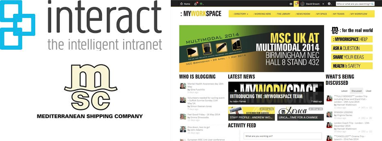
Multiple approaches to accessing information were baked into the intranet’s home page.

How employees actually use information is often at odds with how intranets are designed and organized. Employees focus on tasks they need to complete, while intranet information is usually categorized based on the departments that own it.
At MSC UK, the former intranet was woefully underused, driving the communications team to ask employees how they thought about information and how they used the intranet to try to find it. They learned that employees don’t view information in terms of department; instead, they think about it in terms of the problem they’re trying to solve.
Recognizing that many employees engaged in the same core set of tasks repeatedly, the team segmented uses of the intranet into three categories: people getting news, announcements, and updates; those who were collaborating with others; and those who were looking for resources and assistance.
The design of the new intranet reflects these functions in a clean, simplified home page that is quickly accessible from anywhere on the enterprise network. Key resources frequently required by employees—like the staff directory—were all made instantly available.
Employees who previously ignored the intranet are now regular users; in fact, 90 percent of employees are spending time on the intranet as a routine part of their jobs.
For adopting a design that drives usability and functionality, we present Ragan’s 2014 Employee Communications Award for Best Design to MSC UK, represented by Jason Parkes and David Groom of MSC and Nigel Williams from Interact Intranet (the intranet platform MSC selected).
View More Employee Communications Awards 2014 Winners.
Visit Ragan.com/Awards to learn more about awards opportunities.


