Orbis launches appealing website redesign dedicated to fighting blindness
Arresting visuals, crisp writing, and highly navigable pages propel the user through this winning site. The mission is clear—to transform global communities through the gift of vision.

A nonprofit organization, Orbis is dedicated to the prevention and treatment of blindness worldwide through training, research, and advocacy. For more than 30 years, the organization has worked in 92 countries, treating more than 23.3 million blind and visually impaired people and training more than 325,000 eye care professionals.
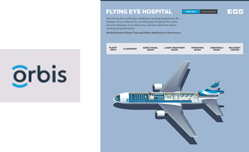
With its recent website redesign, Orbis has created an online space that is user-focused, telling the organization’s story through compelling photography and easily digestible content and offering users the chance to get involved—and donate. The redesign signifies the launch of a new brand and uses key brand narrative pages to draw in visitors. The “Flying Eye Hospital” section takes the visitor inside Orbis’ mobile teaching hospital, an airplane that hosts a classroom and an ophthalmic hospital and is flown around the globe to provide training and care. A slideshow walks users through the plane on a virtual tour, into operating and recovery rooms. Short sidebars below tell the story of a recent successful trip to Mongolia.
Orbis takes home the win for Best Website in PR Daily’s 2014 Digital Awards. The group has seen an upswing in user engagement and satisfaction with its new, visually vibrant design. This can only mean good things for its ongoing mission to treat avoidable blindness and transform lives across the globe.
We congratulate the team that collaborated on the winning effort: Jennifer Gregoire, Elizabeth Goodband, and Adam Tageldin.
View More Digital Awards 2014 Winners.
Visit Ragan.com/Awards to learn more about awards opportunities.


